rm(list=ls())
df <- read.csv('https://www.dropbox.com/scl/fi/rzu7r7c64dr1o3rr2j444/wk9_1.csv?rlkey=zt3a7hp97no5on5zhdezbkszl&dl=1')82 Linear Models for Classification - Practical
82.1 Introduction
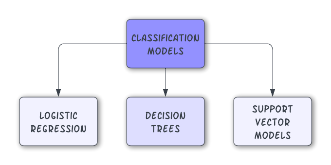
82.2 Logistic Regression
Theory
used for binary classification tasks (also for regression).
predicts the probability of an outcome that can be categorized into one of two groups. For more than two groups, we can use multinomial logistic regression.
assumes linearity of independent variables and log odds.
observations should be independent of each other.
commonly evaluated using metrics like accuracy, precision, recall, ROC curve, and AUC (Area Under the ROC Curve).
Demonstration
![]()
We’ll use the basketball dataset available here:
Our question is: Can we predict whether a basketball player will be an ‘All-Star’ based on their performance metrics and other attributes?
This question is appropriate for logistic regression because the outcome is dichotomous: it’s yes/no.
Create factor/s
Change the DV to a factor (yes/no):
df$all_star <- as.factor(df$all_star)Normalise predictor variables
Normalise the predictor variables (not the DV) to address issues of scale inequality:
# Normalise using Min-Max scaling
normalise_min_max <- function(x) {
  return ((x - min(x)) / (max(x) - min(x)))
}
predictor_columns <- c('average_points', 'average_assists', 'average_rebounds', 'team_experience')
df[predictor_columns] <- as.data.frame(lapply(df[predictor_columns], normalise_min_max))
Create training and testing datasets
Now, I split the normalised data into training and testing sets.
set.seed(123)
sample_size <- floor(0.8 * nrow(df))  # 80% for training
train_indices <- sample(seq_len(nrow(df)), size = sample_size)
train_data <- df[train_indices, ]
test_data <- df[-train_indices, ]
Fit mode
Now, I fit a logistic regression model using four of the predictor variables:
model <- glm(all_star ~ average_points + average_assists + average_rebounds + team_experience,
             data = train_data, family = binomial())
Inspect model output
I can inspect the output of that model:
summary(model)
Call:
glm(formula = all_star ~ average_points + average_assists + average_rebounds +
    team_experience, family = binomial(), data = train_data)

Coefficients:
                 Estimate Std. Error z value Pr(>|z|)
(Intercept)       -8.4216     1.4506  -5.806 6.41e-09 ***
average_points     4.1685     1.3023   3.201  0.00137 **
average_assists    2.5923     1.0910   2.376  0.01749 *
average_rebounds   0.5219     0.9839   0.530  0.59581
team_experience    0.7375     0.9858   0.748  0.45441
---
Signif. codes:  0 '***' 0.001 '**' 0.01 '*' 0.05 '.' 0.1 ' ' 1

(Dispersion parameter for binomial family taken to be 1)

    Null deviance: 129.00  on 522  degrees of freedom
Residual deviance: 107.21  on 518  degrees of freedom
AIC: 117.21

Number of Fisher Scoring iterations: 7
Check model fit
Using the training data, I can check for model fit. The Hosmer and Lemeshow GOF test tells us whether the predictions are significantly different from the actual data.
A high p-value (e.g., > 0.05) suggests no significant difference, and that our model is a good fit for the data.
library(ResourceSelection)ResourceSelection 0.3-6 2023-06-27hoslem.test(train_data$all_star, fitted(model))Warning in Ops.factor(1, y): '-' not meaningful for factors
    Hosmer and Lemeshow goodness of fit (GOF) test

data:  train_data$all_star, fitted(model)
X-squared = 523, df = 8, p-value < 2.2e-16
Apply to testing dataset
Because I have a testing dataset, I can now make predictions using my model and see how they match the ‘real’ data:
predicted_probabilities <- predict(model, newdata = test_data, type = "response")
predicted_classes <- ifelse(predicted_probabilities > 0.5, 1, 0)
Examine predictions
The confusion matrix helps us see how ‘good’ our model is in terms of its predictive power:
confusion_matrix <- table(Predicted = predicted_classes, Actual = test_data$all_star)
print(confusion_matrix)
Actual
Predicted 0 1
0 124 7This shows that the model predicted 0 when the outcome was actually 0 124 times, and was only wrong on 7 occasions.
We can calculate the model’s accuracy from the confusion matrix
accuracy <- sum(diag(confusion_matrix)) / sum(confusion_matrix)
print(paste("Accuracy:", accuracy))
[1] "Accuracy: 0.946564885496183"We can also use the ROC curve and AUC for the testing set
library(pROC)Type 'citation("pROC")' for a citation.
Attaching package: 'pROC'The following objects are masked from 'package:stats':
cov, smooth, varroc_curve <- roc(test_data$all_star, predicted_probabilities)Setting levels: control = 0, case = 1Setting direction: controls < casesplot(roc_curve)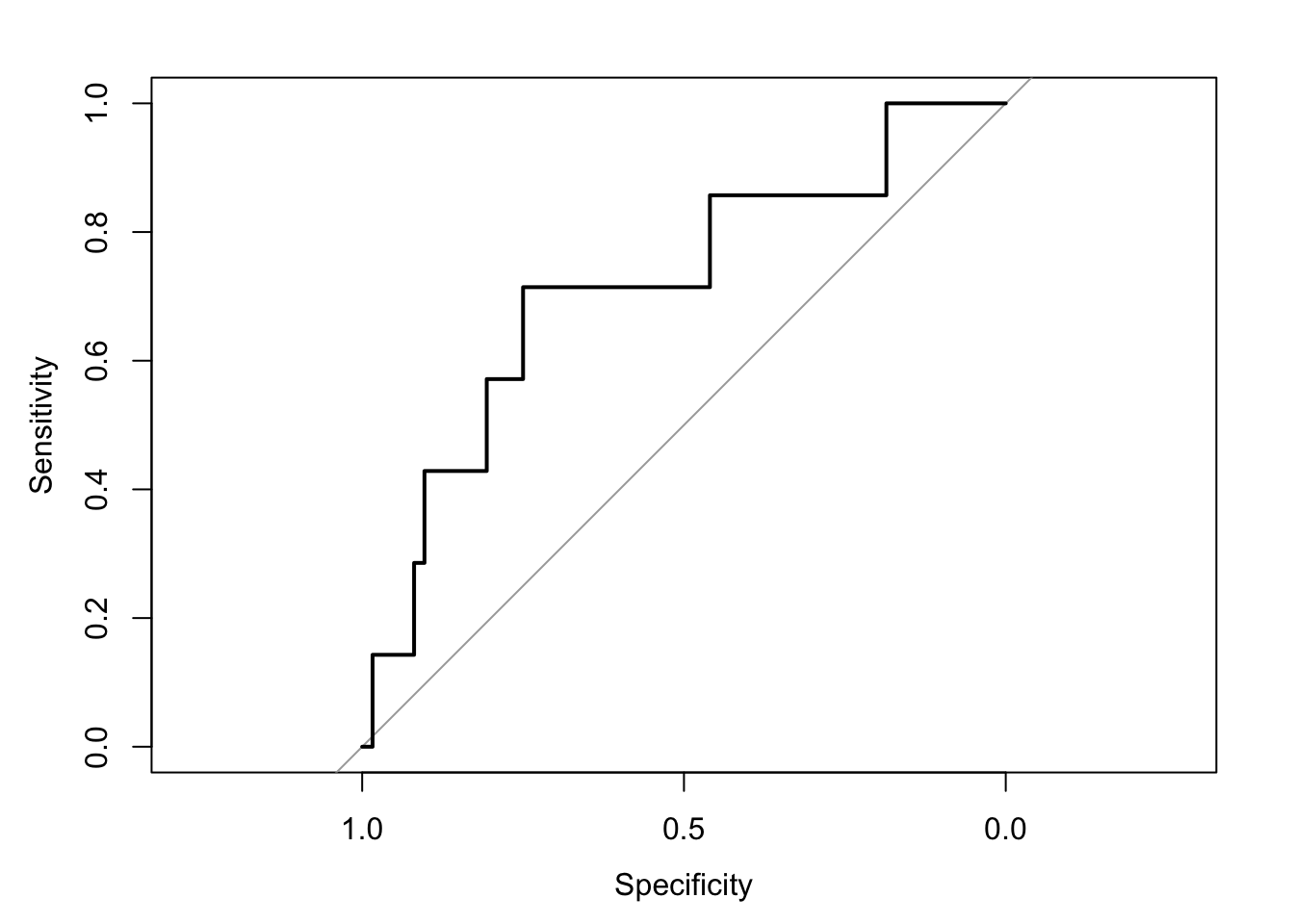
auc_value <- auc(roc_curve)
print(paste("AUC value:", auc_value))
[1] "AUC value: 0.715437788018433"# The AUC value helps to interpret the model's ability to discriminate between classes.Practice
- First, load the F1 dataset here:
rm(list=ls())
df <- read.csv('https://www.dropbox.com/scl/fi/4huhvcj21dlizwso430ma/wk9_2.csv?rlkey=2f5j7kg68rgkimuduz6j3tm8v&dl=1')
Now, decide on which features will appear in your model. Use
PodiumFinishas your outcome (dependent) variable.- You may want to start by building a simple model first, then adding predictors to see what impact they have.
- Normalise your predictor variables using Min-Max scaling. Don’t normalise your outcome variable.
hint
normalise_min_max <- function(x) {
  return ((x - min(x)) / (max(x) - min(x)))
}
predictor_columns <- c('DriverAge', 'CarPerformanceIndex', 'QualifyingTime', 'TeamExperience', 'EnginePower', 'WeatherCondition', 'CircuitType', 'PitStopStrategy')
df[predictor_columns] <- as.data.frame(lapply(df[predictor_columns], normalise_min_max))
Split your data into training and testing datasets.
Fit your model.
Check your model fit.
Use your model to make predictions on your testing dataset. How does your model perform when you look at the confusion matrix? Try different models…compare performance.
82.3 Decision Trees
Theory
predominantly used for classification and regression tasks.
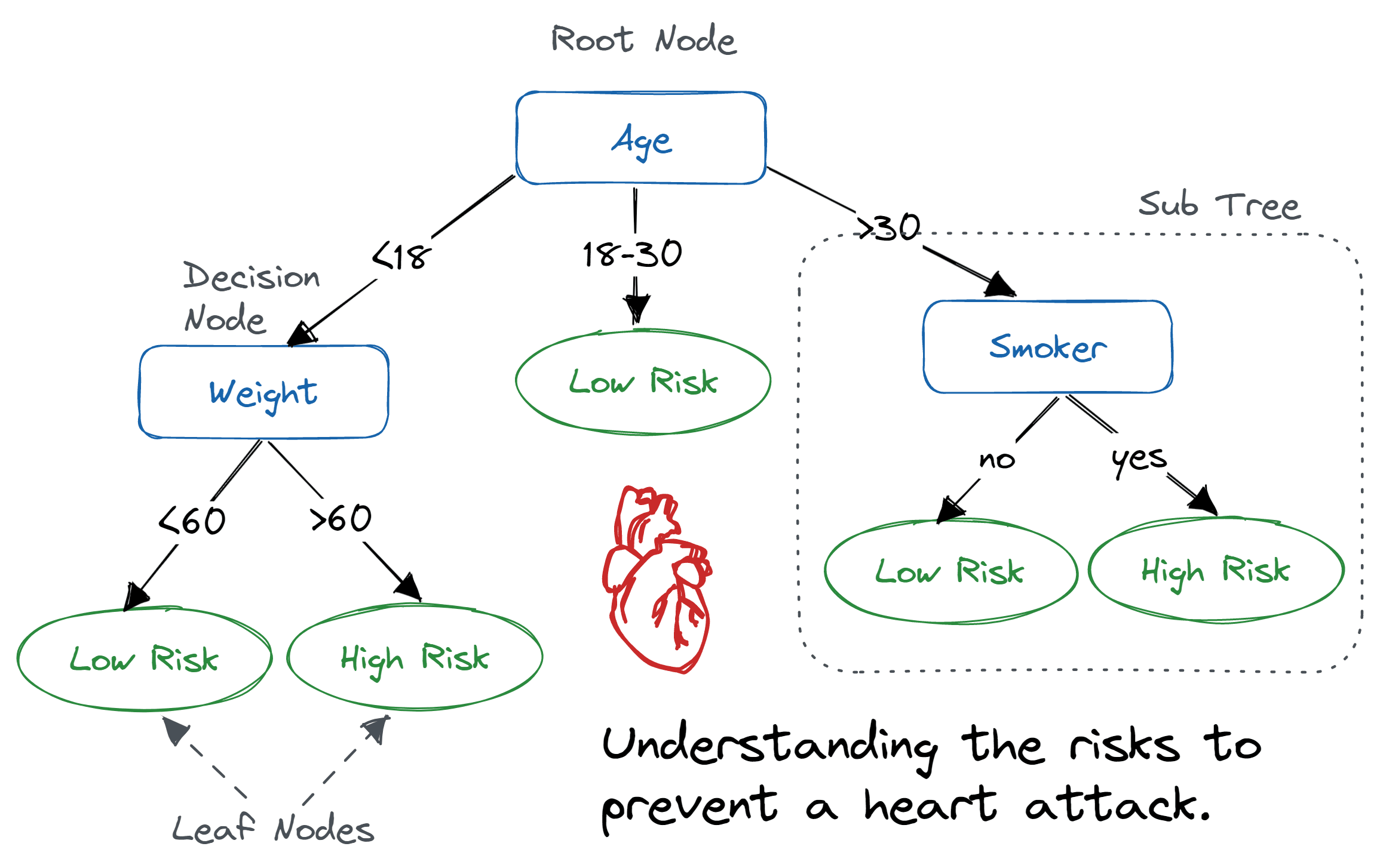
mimic human decision-making processes by splitting data into subsets based on feature values, forming a tree-like structure.
comprises nodes (tests on features), branches (outcomes of tests), and leaf nodes (decision outcomes or target values).
top node is the ‘root’ node, and each leaf represents a class label (in classification) or continuous value (in regression).
learning process involves splitting the dataset into subsets based on an attribute value that results in the most significant information gain or the least impurity (e.g., Gini impurity, entropy).
process is recursive and continues until a stopping criterion is met, such as a maximum depth or minimal improvement in impurity.
easy to understand and interpret, often requiring little data preparation = can handle both numerical and categorical data and can model nonlinear relationships.
prone to overfitting, especially with complex trees.
Simple models
A simple decision tree is a single representation of one model. It is a statistical attempt to create the ‘best’ model for the data.
Demonstration
First, I load the dataset. I also make sure that the outcome variable is defined as a factor, with two levels.
rm(list=ls())

# input dataset
df <- read.csv('https://www.dropbox.com/scl/fi/97hrlppmr4z7g3a1opc9o/wk9_3.csv?rlkey=atjzew7u0v9ff0moo4gqrr5iv&dl=1')

# create factor with two levels (0 and 1)
df$top_player <- factor(df$top_player, levels = c(0, 1))

# it can be helpful to create labels with your factors
levels(df$top_player) <- c('no', 'yes')
To create a simple decision tree, I’ll first decide on feature selection.
In this dataset, I have a dichotomous outcome variable top_player, which is either ‘yes’ or ‘no’. I also have several predictor (independent) variables that I can examine.
# Load necessary libraries
library(rpart)
library(rpart.plot)
library(randomForest)
library(gbm)
library(caret)
library(ggplot2)

# Split the data into training and testing sets
set.seed(101)

# create indices for 80% selection
training_indices <- createDataPartition(df$top_player, p = 0.8, list = FALSE)
train_data <- df[training_indices, ] # create training data
test_data <- df[-training_indices, ] # create testing data
Now, I fit my model using all of the variables in the dataset.
# Fit the model
single_tree_model <- rpart(top_player ~ ., data = train_data, method = "class")
I can inspect my model visually using the rpart.plot function:
rpart.plot(single_tree_model, main="Is player a 'top' player?", extra=104)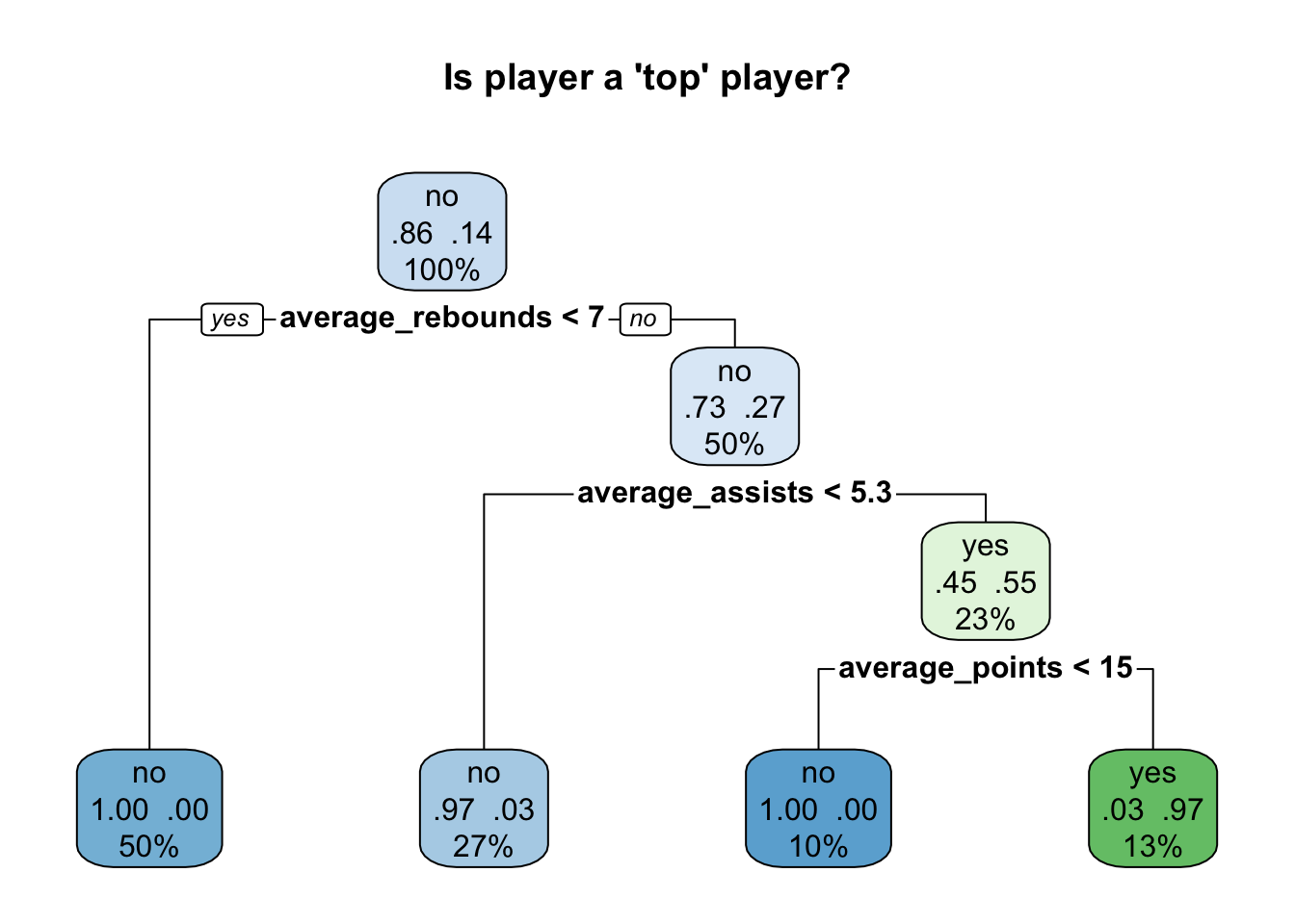
I can use this model to create predictions on my testing data, and compare how accurate these predictions are compared to the real outcomes.
# Predict and evaluate
single_tree_predictions <- predict(single_tree_model, test_data, type = "class")
confusionMatrix(single_tree_predictions, test_data$top_player)
Confusion Matrix and Statistics
Reference
Prediction no yes
no 168 6
yes 4 21
Accuracy : 0.9497
95% CI : (0.9095, 0.9756)
No Information Rate : 0.8643
P-Value [Acc > NIR] : 7.13e-05
Kappa : 0.7788
Mcnemar's Test P-Value : 0.7518
Sensitivity : 0.9767
Specificity : 0.7778
Pos Pred Value : 0.9655
Neg Pred Value : 0.8400
Prevalence : 0.8643
Detection Rate : 0.8442
Detection Prevalence : 0.8744
Balanced Accuracy : 0.8773
'Positive' Class : no
I can continue to inspect how predictions compare with ‘actual’ data:
# use those criteria to check accuracy of predictions
filtered_data <- subset(df, average_rebounds >= 7 & average_assists >= 5.3 & average_points >= 15)

# Ensure ggplot2 is loaded
library(ggplot2)

# Create a bar plot for the count of top players and non-top players using the filtered data
ggplot(filtered_data, aes(x = top_player, fill = as.factor(top_player))) +
  geom_bar() +
  scale_fill_manual(values = c("red", "blue"), name = "Top Player",
                    labels = c("Not actually top player", "Top Player")) +
  labs(title = "Predictions vs. Actuality - model got most predictions right",
       x = "Top Player Status",
       y = "Count") +
  theme_minimal()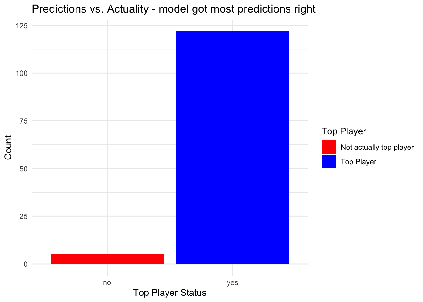
Practice
Repeat those steps on the F1 dataset here:
rm(list=ls())
df <- read.csv('https://www.dropbox.com/scl/fi/4huhvcj21dlizwso430ma/wk9_2.csv?rlkey=2f5j7kg68rgkimuduz6j3tm8v&dl=1')
As before, use PodiumFinish as your outcome (dependent) variable.
Remember to normalise your predictor variables, and to make your outcome variable a factor.
Choose two or three predictors at a time, and create different decisions trees with these predictors.
solutions
df$PodiumFinish <- factor(df$PodiumFinish, levels = c(0, 1))
levels(df$PodiumFinish) <- c('no', 'yes')

# Load necessary libraries
library(rpart)
library(rpart.plot)
library(randomForest)
library(gbm)
library(caret)
library(ggplot2)

# Split the data into training and testing sets
set.seed(101)  # Ensure reproducibility
training_indices <- createDataPartition(df$PodiumFinish, p = 0.8, list = FALSE)
train_data <- df[training_indices, ]
test_data <- df[-training_indices, ]

# Fit the model
single_tree_model <- rpart(PodiumFinish ~ CarPerformanceIndex + EnginePower + TeamExperience, data = train_data, method = "class")

# Predict and evaluate
single_tree_predictions <- predict(single_tree_model, test_data, type = "class")
confusionMatrix(single_tree_predictions, test_data$PodiumFinish)

rpart.plot(single_tree_model, main="Podium Finish?", extra=104)
Random forests
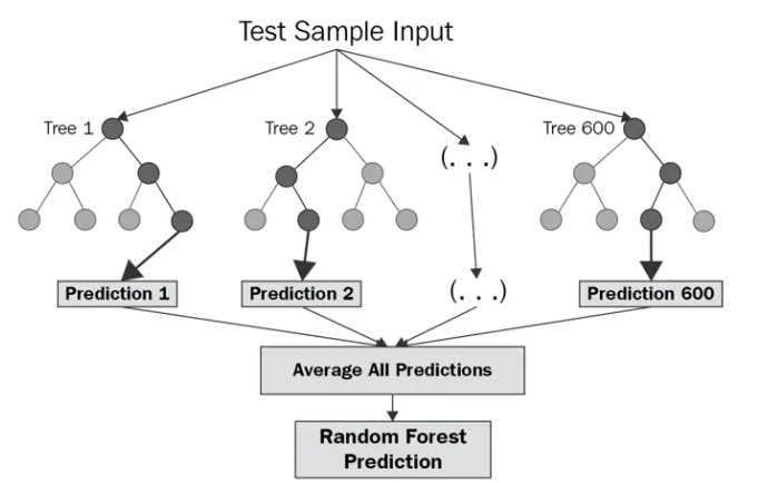
- Random forests improve prediction accuracy and reduce overfitting by averaging multiple decision tree results.
- They build numerous trees using bootstrapped datasets and random feature subsets at each split, enhancing diversity.
- These forests are robust, handle large, high-dimensional data well, and are less prone to overfitting than single trees.
- Offer valuable insights into feature importance, highlighting which variables most significantly influence predictions.
Demonstration
#----------------------
# Clear
#----------------------
rm(list=ls())

#----------------------
# Load dataset
#----------------------
df <- read.csv('https://www.dropbox.com/scl/fi/97hrlppmr4z7g3a1opc9o/wk9_3.csv?rlkey=atjzew7u0v9ff0moo4gqrr5iv&dl=1')

#----------------------
# Data preparation
#----------------------
# create factor
df$top_player <- factor(df$top_player, levels = c(0, 1))
levels(df$top_player) <- c('no', 'yes')

# Normalise using Min-Max scaling
normalise_min_max <- function(x) {
  return ((x - min(x)) / (max(x) - min(x)))
}
predictor_columns <- c('players_age', 'team_experience', 'average_points', 'average_assists', 'average_rebounds', 'player_position', 'injury_history', 'free_throw_accuracy')
df[predictor_columns] <- as.data.frame(lapply(df[predictor_columns], normalise_min_max))

#----------------------
# Split into training and testing sets
#----------------------

set.seed(101)
training_indices <- createDataPartition(df$top_player, p = 0.8, list = FALSE)
train_data <- df[training_indices, ]
test_data <- df[-training_indices, ]

#----------------------
# Create Random Forest
#----------------------
# Fit model with all IVs
random_forest_model <- randomForest(top_player ~ ., data = train_data)

# Predict and evaluate
rf_predictions <- predict(random_forest_model, test_data)
confusionMatrix(rf_predictions, test_data$top_player)
Confusion Matrix and Statistics
Reference
Prediction no yes
no 172 7
yes 0 20
Accuracy : 0.9648
95% CI : (0.9289, 0.9857)
No Information Rate : 0.8643
P-Value [Acc > NIR] : 1.665e-06
Kappa : 0.8316
Mcnemar's Test P-Value : 0.02334
Sensitivity : 1.0000
Specificity : 0.7407
Pos Pred Value : 0.9609
Neg Pred Value : 1.0000
Prevalence : 0.8643
Detection Rate : 0.8643
Detection Prevalence : 0.8995
Balanced Accuracy : 0.8704
'Positive' Class : no
As there are many decision trees in a random forest model, it isn’t possible to plot them in the conventional way. We can, however, generate a plot showing the importance of each feature in the random forest model. The features are ranked by their importance in making accurate predictions, with the most important features at the top:
# Plot variable importance
importance <- importance(random_forest_model)
varImpPlot(random_forest_model)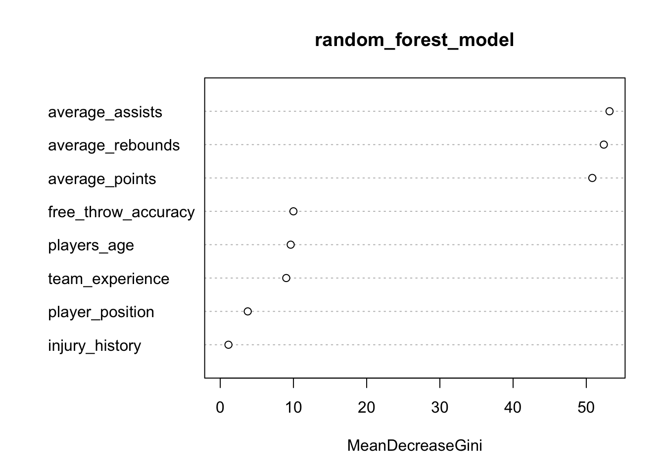
We can plot the importance of the features this way as well:
library(ggplot2)

# Transforming the importance data frame for ggplot
importance_df <- data.frame(Feature = rownames(importance), Importance = importance[,1])

# Create the plot
ggplot(importance_df, aes(x = reorder(Feature, Importance), y = Importance)) +
  geom_bar(stat = "identity") +
  coord_flip() +  # Flip coordinates for horizontal bar chart
  labs(title = "Feature Importance in Predicting 'Top Player'",
       x = "Feature",
       y = "Importance") +
  theme_minimal()
Practice
Repeat all these steps on the F1 dataset here:
rm(list=ls())
df <- read.csv('https://www.dropbox.com/scl/fi/4huhvcj21dlizwso430ma/wk9_2.csv?rlkey=2f5j7kg68rgkimuduz6j3tm8v&dl=1')
82.4 Support vector machines
Theory
Support Vector Machines (SVMs) are supervised learning models that identify the optimal hyperplane separating different classes in feature space.
SVMs focus on maximising the margin between classes, enhancing model generalisation and robustness.
They employ kernel functions to transform data into higher dimensions where linear separation is possible, facilitating non-linear classification.
SVMs are known for their strong performance in both classification and regression tasks, especially with clear margin of separation.
Demonstration
First, I load the e1071 library, which provides functions for SVM:
library(e1071)
library(caret)
Data preparation
rm(list=ls())
df <- read.csv('https://www.dropbox.com/scl/fi/97hrlppmr4z7g3a1opc9o/wk9_3.csv?rlkey=atjzew7u0v9ff0moo4gqrr5iv&dl=1')

df$top_player <- factor(df$top_player, levels = c(0, 1))
Split data into training (80%) and test (20%) sets:
training_indices <- createDataPartition(df$top_player, p = 0.8, list = FALSE)
train_data <- df[training_indices, ]
test_data <- df[-training_indices, ]
Scale data
It’s important to scale the predictor variables since SVMs are sensitive to the scale of the input data.
# Scale predictor variables in both training and testing sets
# Exclude the target variable 'top_player' from this

train_data_scaled <- as.data.frame(scale(train_data[,-ncol(train_data)]))
train_data_scaled$top_player <- train_data$top_player

test_data_scaled <- as.data.frame(scale(test_data[,-ncol(test_data)]))
test_data_scaled$top_player <- test_data$top_player
Run SVM model
# SVM model on training data
svm_model <- svm(top_player ~ ., data = train_data_scaled, type = 'C-classification', kernel = "radial", cost = 1)
Create predictions
# Predict using the SVM model on  test data
svm_predictions <- predict(svm_model, test_data_scaled)
Make predictions factors as well
# Since the prediction outputs are factors, ensure that they have the same levels as the test data outcomes
svm_predictions <- factor(svm_predictions, levels = levels(test_data_scaled$top_player))
Check model fit
By exploring model fit, we can determine whether this model is better or worse than others in accurately classifying the outcome variable.
# use confusion matrix
conf_matrix <- confusionMatrix(svm_predictions, test_data_scaled$top_player)
print(conf_matrix)
Confusion Matrix and Statistics
Reference
Prediction 0 1
0 171 12
1 1 15
Accuracy : 0.9347
95% CI : (0.8909, 0.9648)
No Information Rate : 0.8643
P-Value [Acc > NIR] : 0.001250
Kappa : 0.6637
Mcnemar's Test P-Value : 0.005546
Sensitivity : 0.9942
Specificity : 0.5556
Pos Pred Value : 0.9344
Neg Pred Value : 0.9375
Prevalence : 0.8643
Detection Rate : 0.8593
Detection Prevalence : 0.9196
Balanced Accuracy : 0.7749
'Positive' Class : 0
# Print overall statistics like accuracy
accuracy <- conf_matrix$overall['Accuracy']
print(accuracy)
Accuracy
0.9346734 # Print class-specific measures
sensitivity <- conf_matrix$byClass['Sensitivity']
specificity <- conf_matrix$byClass['Specificity']
print(sensitivity)Sensitivity
0.994186 print(specificity)Specificity
0.5555556 Visualisations
It’s difficult to produce useful visualisations for SVMs, as they are multi-dimensional. However, we can plot two features at a time, and examine the decision boundaries created by the SVM:
library(ggplot2)
library(e1071)

features_to_visualise <- c("average_points", "average_assists")

# Create a subset of data with the selected features and the outcome
svm_data_vis <- data.frame(train_data_scaled[, features_to_visualise], top_player = train_data_scaled$top_player)

# Train the SVM model on the subset
svm_model_vis <- svm(top_player ~ ., data = svm_data_vis, kernel = "radial", cost = 1)

# Create a grid to predict over the feature space
plot_grid <- expand.grid(average_points = seq(min(svm_data_vis$average_points), max(svm_data_vis$average_points), length = 100),
                         average_assists = seq(min(svm_data_vis$average_assists), max(svm_data_vis$average_assists), length = 100))

# Predict the class membership probabilities
plot_grid$top_player <- predict(svm_model_vis, plot_grid)

# Create the plot
ggplot(svm_data_vis, aes(x = average_points, y = average_assists)) +
  geom_tile(data = plot_grid, aes(fill = top_player, x = average_points, y = average_assists), alpha = 0.5) +
  geom_point(aes(color = top_player)) +
  scale_fill_manual(values = c('red', 'blue')) +
  scale_color_manual(values = c('red', 'blue')) +
  labs(title = "SVM Decision Boundary", x = "Average Points", y = "Average Assists") +
  theme_minimal()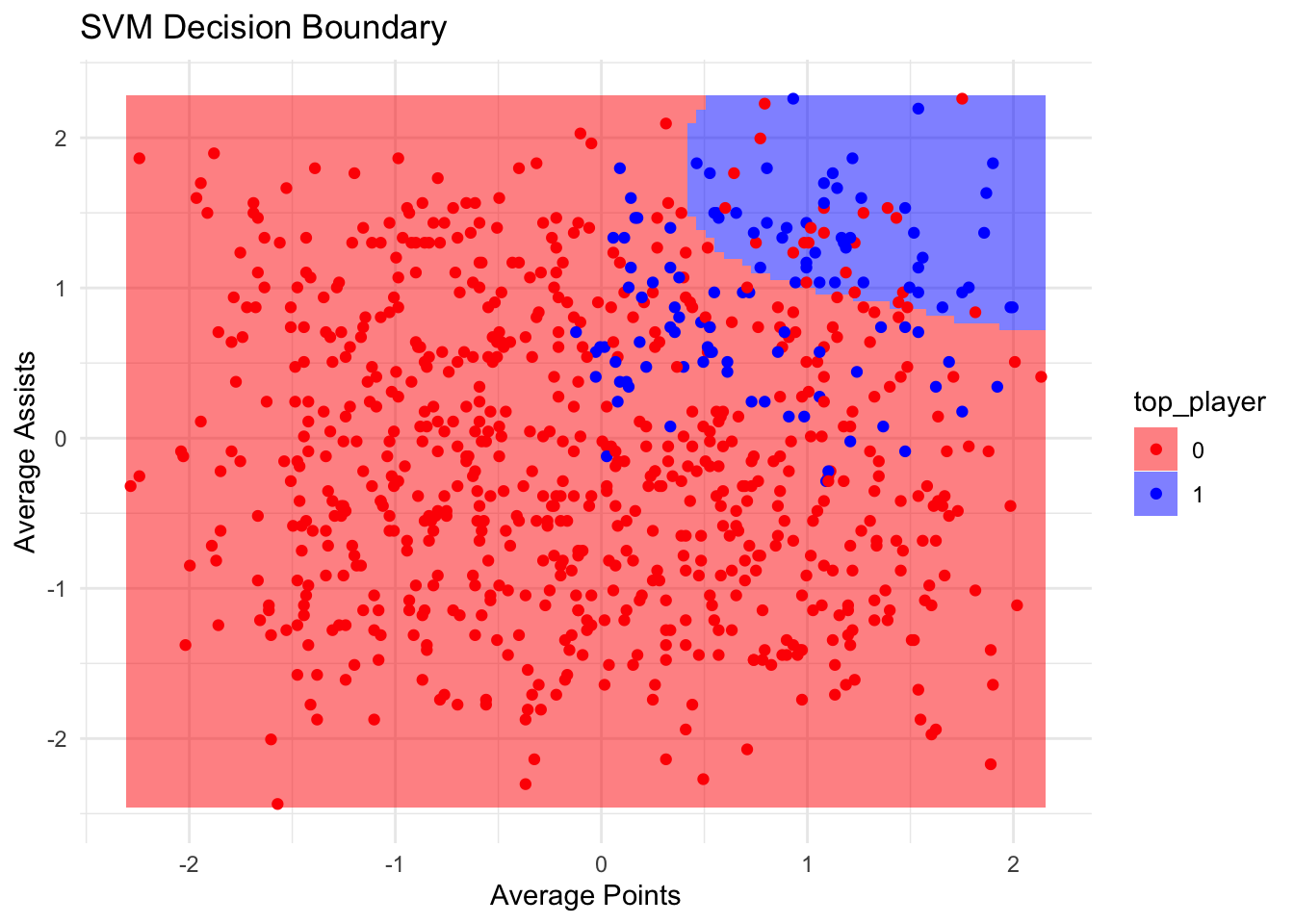
Practice
Repeat all these steps on the dataset here. The outcome variable is Category.
rm(list=ls())
df <- read.csv('https://www.dropbox.com/scl/fi/tblanh7tb7gzm2uqidapt/curling.csv?rlkey=zbvhig28qn7792w6swciw5j8s&dl=1')
Note: category has two classes; Amateur and Professional. This needs to be handled when creating factor.